Monday, 21 April 2014
Evaluation - Question 7
Looking back at your preliminary task, what do you feel you have learnt in the progression from it to the full product?
Evaluation - Question 6
What have you learnt about technologies from the process of constructing this product?
Whilst constructing my magazine, I have come across pieces of software and technology that I have never used before, the first of these being Adobe InDesign.

InDesign is what I used the most whilst constructing my magazine. Before producing my music magazine pages, I had some practise on this software with the preliminary task. At first I found it very hard to use as it has many components which need to go into making magazine pages, but once I had finished my school magazine pages I had started to understand how to use the program. I spent many hours using this software to create my front cover, contents page and article. It was very useful in the making of my magazine, and after time I found it very easy to use.

I had also never used Blogger until starting this task. Blogger is a way of tracking my work step by step, it is very easy to use and I really like the structure of the website. I also downloaded the app onto my mobile phone and it worked just as well. I have enjoyed displaying my work in this way because Blogger has a structured layout which makes my work easy to locate and read.

 I found Photoshop, in particular, very hard to use. As there were so many ways of editing an image I wasn't quite sure where to start, but after familiarising myself with this program, I began to get the hang of it. I originally removed the background of an image to be used for the front cover but I decided I preferred a different image. Even though I didn't use this image I felt it was a good experience and I felt I was much more comfortable with the program afterwards. I edited many images on Photoshop because it made the quality of my images better. A criticism of this program is that I found it was far too time consuming, even with the little adjustments I made to my images. However it did make a positive difference.
A creative way of displaying my work was through an online application, Prezi. It is an alternative way of doing a presentation and it presents work in a very attractive way. I have used Prezi beforehand for different subjects in Sixth Form and I have always found it easy to use. I really like how quick it is to create a presentation and that is why I have used it for other posts in my work.


Another way of showing my work instead of traditional blogging was creating a Powerpoint Presentation. I have used it for many years to create presentations and I find it very easy to use. It is a simple way of displaying work.
A Powerpoint has to be uploaded on to Slideshare, an online application so that it can be seen on Blogger. Sometimes my Powerpoint Presentations would change once they had been uploaded onto Slideshare and I would have to upload it again and adjust things it had changed. I felt that was a huge problem with using this application but it was worth it as it creates a different way of posting on my blog. It makes my posts much more easy on the eye.

To capture my images I used my Fujifilm camera. It produced high quality images and it was vital when needing pictures for my magazine. I learnt a lot when taking the images for this task because I had to think about the angle, lighting, mise-en-scene and distance of the shot. It meant I was getting more familiar with my own camera. I created planning documents so that it wouldn't take too long taking my images, and I was successful with each image I took for my magazine because of this.


During the construction of my magazine I have also used a laptop and the internet to help with a lot of my work. I have used the laptop to create most of my work on the programs on the computer. Without it I couldn't have used the software that I required. I used the internet to collect research for my magazine and also use online publications. It has been vital in creating my magazine and it is very easy to use.
I have come across new and old technology in the making of my magazine and I am sure that they will become useful again in the future.
Whilst constructing my magazine, I have come across pieces of software and technology that I have never used before, the first of these being Adobe InDesign.
InDesign is what I used the most whilst constructing my magazine. Before producing my music magazine pages, I had some practise on this software with the preliminary task. At first I found it very hard to use as it has many components which need to go into making magazine pages, but once I had finished my school magazine pages I had started to understand how to use the program. I spent many hours using this software to create my front cover, contents page and article. It was very useful in the making of my magazine, and after time I found it very easy to use.
I had also never used Blogger until starting this task. Blogger is a way of tracking my work step by step, it is very easy to use and I really like the structure of the website. I also downloaded the app onto my mobile phone and it worked just as well. I have enjoyed displaying my work in this way because Blogger has a structured layout which makes my work easy to locate and read.
I found Photoshop, in particular, very hard to use. As there were so many ways of editing an image I wasn't quite sure where to start, but after familiarising myself with this program, I began to get the hang of it. I originally removed the background of an image to be used for the front cover but I decided I preferred a different image. Even though I didn't use this image I felt it was a good experience and I felt I was much more comfortable with the program afterwards. I edited many images on Photoshop because it made the quality of my images better. A criticism of this program is that I found it was far too time consuming, even with the little adjustments I made to my images. However it did make a positive difference.A creative way of displaying my work was through an online application, Prezi. It is an alternative way of doing a presentation and it presents work in a very attractive way. I have used Prezi beforehand for different subjects in Sixth Form and I have always found it easy to use. I really like how quick it is to create a presentation and that is why I have used it for other posts in my work.
Another way of showing my work instead of traditional blogging was creating a Powerpoint Presentation. I have used it for many years to create presentations and I find it very easy to use. It is a simple way of displaying work.
A Powerpoint has to be uploaded on to Slideshare, an online application so that it can be seen on Blogger. Sometimes my Powerpoint Presentations would change once they had been uploaded onto Slideshare and I would have to upload it again and adjust things it had changed. I felt that was a huge problem with using this application but it was worth it as it creates a different way of posting on my blog. It makes my posts much more easy on the eye.
To capture my images I used my Fujifilm camera. It produced high quality images and it was vital when needing pictures for my magazine. I learnt a lot when taking the images for this task because I had to think about the angle, lighting, mise-en-scene and distance of the shot. It meant I was getting more familiar with my own camera. I created planning documents so that it wouldn't take too long taking my images, and I was successful with each image I took for my magazine because of this.
During the construction of my magazine I have also used a laptop and the internet to help with a lot of my work. I have used the laptop to create most of my work on the programs on the computer. Without it I couldn't have used the software that I required. I used the internet to collect research for my magazine and also use online publications. It has been vital in creating my magazine and it is very easy to use.
I have come across new and old technology in the making of my magazine and I am sure that they will become useful again in the future.
Evaluation - Question 3
What kind of media institution might distribute your media product and why?
 I would want my magazine to be a part of one of the biggest publishing groups in Europe, Bauer. This is because they have 80 brands serving 19,000,000 people, they have a huge audience with 4 out of 10 people experiencing one of their products. They state on their website:
"Our business is built on millions of personal relationships with engaged audiences"
The success of Bauer and the worldwide recognition they have could help my product grow. It would mean I could be supported by a company who understands the magazine industry completely.
As LEAD is a multi-platform brand I would want each platform to be as successful as possible. Bauer could offer different platforms such as radio and television and make each platform recognisable.
Bauer state that they 'connect with diverse and valuable audiences' and this is what I would be looking for when publishing my magazine.
Even though there are other publishing groups such as IPC media, I feel that Bauer would help push my media product to it's full potential and attract a new audience to their already huge fan base. They publish brands such as Q and Mojo magazine, and I feel there is a space in the market for Bauer with my indie/rock magazine, LEAD.
 To distribute my magazine, I would want the biggest magazine distributor in the UK, Frontline. Frontline sells and distributes over 160 magazine titles, including 54 of the top 200 selling titles in the UK. They publish magazines such as Q and Mojo. As Frontline are so successful, it is the obvious choice to be the distributor of my magazine. Frontline also try to make a difference by raising money for good causes, I believe that if LEAD is associated with this, that it would appeal to a bigger audience.
I would want my magazine to be a part of one of the biggest publishing groups in Europe, Bauer. This is because they have 80 brands serving 19,000,000 people, they have a huge audience with 4 out of 10 people experiencing one of their products. They state on their website:"Our business is built on millions of personal relationships with engaged audiences"
The success of Bauer and the worldwide recognition they have could help my product grow. It would mean I could be supported by a company who understands the magazine industry completely.
As LEAD is a multi-platform brand I would want each platform to be as successful as possible. Bauer could offer different platforms such as radio and television and make each platform recognisable.
Bauer state that they 'connect with diverse and valuable audiences' and this is what I would be looking for when publishing my magazine.
Even though there are other publishing groups such as IPC media, I feel that Bauer would help push my media product to it's full potential and attract a new audience to their already huge fan base. They publish brands such as Q and Mojo magazine, and I feel there is a space in the market for Bauer with my indie/rock magazine, LEAD.
To distribute my magazine, I would want the biggest magazine distributor in the UK, Frontline. Frontline sells and distributes over 160 magazine titles, including 54 of the top 200 selling titles in the UK. They publish magazines such as Q and Mojo. As Frontline are so successful, it is the obvious choice to be the distributor of my magazine. Frontline also try to make a difference by raising money for good causes, I believe that if LEAD is associated with this, that it would appeal to a bigger audience.Evaluation - Question 2
How does the Media Product represent a particular social group?
When starting to research what kind of magazine I wanted to do, I came across magazines which gave me inspiration in my ideas for images. I wanted to appeal to an indie/rock audience, so I had to portray that social group in my magazine. I wanted to appeal to 17-24 year olds and so this had to be evident in my magazine.

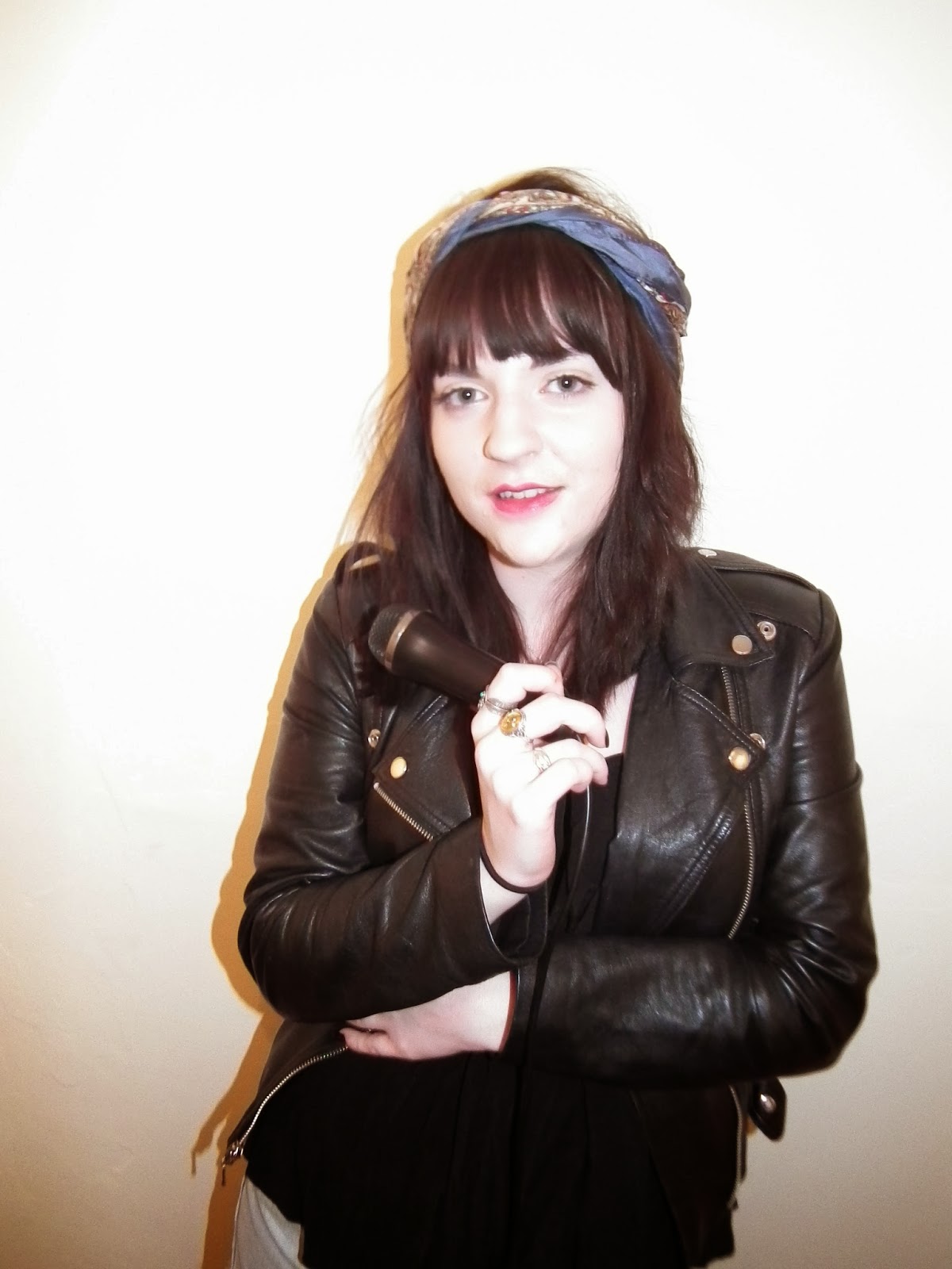
I came across this image of Florence when thinking of poses for my model, Lottie, to do. This image is more indie than rock, but I like how she has positioned her arms, as if she is slightly uncomfortable and unsure. I felt I could use this pose on Lottie. People who are in the indie social group like having their own identity and this body language could help give Lottie her own identity.

I decided I would take this image of Florence and re-create it for my indie/rock social magazine. Lottie is wearing black boots, shiny silver tights, denim shorts, a black top and leather jacket. She also is wearing a headscarf and jewellery. This costume oozes Lottie's indie/rock style and would attract this type of social group to the magazine because they would like how she dresses. I noticed that Florence wasn't wearing much make-up as an indie artist, therefore I decided that I didn't want Lottie to wear much. I gave her red lipstick which made her lips stand out, it represents her indie/rock style by wearing harsh colours on a pale face. This image would attract a young, stylish audience looking in from an indie/rock perspective. It represents the indie/rock style. The colour scheme I used of red, black, yellow and white represents the social group I chose, as these colours are regularly found on indie/rock magazines. The bands and artists shown on the front cover reflects the type of music the indie/rock social group like listening to and I feel it is a good and accurate representation.

 The images in my contents page reflect the different aspects of the indie/rock music industry, since not every artist is the same. To fully grasp the different types of artists and bands in the indie/rock music industry I decided to base my images on real artists in magazines. For instance, I saw that Dave Grohl, lead singer from Foo Fighters, had his guitar on his shoulder on the Q contents page. I decided to take the idea of having a guitar in the image and transfer it into Lottie's image, to show her passion for music as do a lot of the social group targeted for my magazine. Oasis frontman, Noel Gallagher used a customised Epiphone Sheraton known as 'the Supernova'. Lottie's guitar is the same make and this could show her influences as an artist from this social group.

 I also represented the young, indie/rock social group by including up to date technology with the use of social media into the brand LEAD. In my contents page I included a page for LEAD's app on an i-pad, a Facebook page a Twitter page and I also included a web address. This reflects the young technophiles I am trying to target, as they are up to date with new technology. In my Editor's letter I called the readers 'LEADers' as more and more young people are starting to put themselves into 'fan clubs'. This language reflects the immaturity of some people in this social group.
The other images I used in my contents page also reflect the indie/rock social group. As Luke, the male model, is wearing a black leather jacket showing the type of clothes this social group like to wear. A similar image to this is Noel Gallagher in Q magazine on the front cover. I believe these images show the social group in an accurate light. The images appeal to the audience as they can take inspiration from their music hero's.
 The information in this article would appeal to the indie/rock social group as, stereotypically, they are in contact with drugs and alcohol. There could be pressures into people taking them, therefore the message in this story could appeal to those who are taking drugs and those who want to change their lifestyle. The image of Lottie getting out of the car is illustrated in a negative light as, all too often, this is how people are portrayed in the media after a night out, and this is how this social group can be represented after going to a club, along with many other people. As Lottie is aged 20 herself, this would appeal to the young audience.
Overall I believe I have represented the social group accurately in my media product as I researched all aspects of the indie/rock scene and tried to fit my magazine to suit them. It would interest them as they are the soul target for my magazine.
When starting to research what kind of magazine I wanted to do, I came across magazines which gave me inspiration in my ideas for images. I wanted to appeal to an indie/rock audience, so I had to portray that social group in my magazine. I wanted to appeal to 17-24 year olds and so this had to be evident in my magazine.
I came across this image of Florence when thinking of poses for my model, Lottie, to do. This image is more indie than rock, but I like how she has positioned her arms, as if she is slightly uncomfortable and unsure. I felt I could use this pose on Lottie. People who are in the indie social group like having their own identity and this body language could help give Lottie her own identity.
I decided I would take this image of Florence and re-create it for my indie/rock social magazine. Lottie is wearing black boots, shiny silver tights, denim shorts, a black top and leather jacket. She also is wearing a headscarf and jewellery. This costume oozes Lottie's indie/rock style and would attract this type of social group to the magazine because they would like how she dresses. I noticed that Florence wasn't wearing much make-up as an indie artist, therefore I decided that I didn't want Lottie to wear much. I gave her red lipstick which made her lips stand out, it represents her indie/rock style by wearing harsh colours on a pale face. This image would attract a young, stylish audience looking in from an indie/rock perspective. It represents the indie/rock style. The colour scheme I used of red, black, yellow and white represents the social group I chose, as these colours are regularly found on indie/rock magazines. The bands and artists shown on the front cover reflects the type of music the indie/rock social group like listening to and I feel it is a good and accurate representation.
The images in my contents page reflect the different aspects of the indie/rock music industry, since not every artist is the same. To fully grasp the different types of artists and bands in the indie/rock music industry I decided to base my images on real artists in magazines. For instance, I saw that Dave Grohl, lead singer from Foo Fighters, had his guitar on his shoulder on the Q contents page. I decided to take the idea of having a guitar in the image and transfer it into Lottie's image, to show her passion for music as do a lot of the social group targeted for my magazine. Oasis frontman, Noel Gallagher used a customised Epiphone Sheraton known as 'the Supernova'. Lottie's guitar is the same make and this could show her influences as an artist from this social group.I also represented the young, indie/rock social group by including up to date technology with the use of social media into the brand LEAD. In my contents page I included a page for LEAD's app on an i-pad, a Facebook page a Twitter page and I also included a web address. This reflects the young technophiles I am trying to target, as they are up to date with new technology. In my Editor's letter I called the readers 'LEADers' as more and more young people are starting to put themselves into 'fan clubs'. This language reflects the immaturity of some people in this social group.The other images I used in my contents page also reflect the indie/rock social group. As Luke, the male model, is wearing a black leather jacket showing the type of clothes this social group like to wear. A similar image to this is Noel Gallagher in Q magazine on the front cover. I believe these images show the social group in an accurate light. The images appeal to the audience as they can take inspiration from their music hero's.
Overall I believe I have represented the social group accurately in my media product as I researched all aspects of the indie/rock scene and tried to fit my magazine to suit them. It would interest them as they are the soul target for my magazine.
Friday, 18 April 2014
Evaluation - Question 1
In what ways does your media product use, develop or challenge forms and conventions of real media products?
Front Cover
Contents Page
Article, Double Page Spread
Wednesday, 2 April 2014
Finished Music Magazine Contents Page

I added a bar at the bottom of the page as when looking back at my research I saw that a lot of magazines do this in order to divide the page. I wanted to show the brand throughout my magazine and therefore I put my masthead in the bottom right hand corner of the page. I also added a page number at the bottom of the page
I have also put the other image onto the contents page, of Luke. I wanted to have a male artist shown on my magazine so that it can appeal to a wider audience. I believe that the image fits in with the indie/rock genre of the magazine and creates a strong appearance of a male artist.
I have changed a couple of things as I wasn't happy with how it looked when everything was on the page. I felt that the white space all around the page made it look squashed so therefore made sure that the sides were touching the end of the page, but that there were still spaces at the top and the bottom. I also included a yellow box for 'This Week' to give it a heading, it makes it look more like a professional magazine by dividing the page into sections.
I am extremely happy with how my contents page has turned out, although it may not look identical to a professional music magazine, I believe I have taken certain aspects from them and adapted it to fit with my magazine. I have achieved everything I wanted to for this page and I am happy that I decided to change my basic design as it added to the end product. I feel that there are things I can improve on for this page such as the layout, but overall I am pleased.
Wednesday, 26 March 2014
Music Magazine Contents Page Progress

Now that I have changed the layout of my page, it means there is more space on the page. So I have stretched out the box so that it doesn't look so cramped. The subscription box is much bigger too, which will definitely catch the readers eye. Even though the review box is smaller, I believe it means that there will be less to read, and it won't give away too much of the review so people will want to read the rest of it. The image of Josh and Billie doesn't look as stretched and it works much better now.
I haven't got much left to do on this page, I may still change a couple of features on the page if it still doesn't look right, but I will judge that once everything is on the page that needs to be.
Music Magazine Contents Page Progress

I changed the colour of the Editor's letter, and gave it a black background because I felt the white looked a bit lost on the page underneath the masthead. The white writing really makes it stand out on the page and draws the readers attention to it. I have also changed the colour of the page numbers in the list of what's in the magazine, but I am still unhappy with how it looks and will have to change the layout of the page so that it looks like a more convincing contents page.
Music Magazine Contents Page Progress

In the top right hand corner I put the issue number and the date of the magazine again so that its recognisable. I used a yellow background to make it pop out of the page and break up the red, black and white.
I wanted to include an Editor's letter in my contents page, therefore I wrote about LEAD festival that they are organising at the moment, as it ties in with the magazine. I used red writing to make it stand out and I thought 'A Word from The Editor' was quite catchy and made it seem short but sweet.
I am happy with the image I chose of Lottie, I cropped it so that only the guitar and her upper body are in the image. It really fits in with the contents page and makes her seem like a fun music artist to work with. I used red and yellow for the page number in the box because they work well together, it is quite big as it is one of the main stories.
I'm quite disappointed with the list of what is in the magazine at the moment, I feel it is tucked away in the corner and doesn't look big enough on the page. It doesn't look like a contents page at present, therefore I must improve this so that it looks like an actual magazine.
Sunday, 16 March 2014
Finished Music Magazine Article Double Page Spread

I achieved my goal of putting Lottie's signature onto the image. I feel it works really well on the page and makes it look much more interesting. By using a feathered effect around the writing, it makes it look as if it was done in lipstick which adds another interesting effect which I love.
I am very happy with how my article has turned out. I have achieved everything I wanted to, and I feel it has all worked out well together. It has changed from my original design but most definitely for the better. I believe that there are some things which could be improved on such as the structure of the writing but I still feel it works really well in the article.
Music Magazine Article Double Page Spread Progress

As I intended to do, I have now included an image of Lottie playing her guitar showing her new self. I believe this image works well as it is focusing on the boots and not the face, it looks as if Lottie is in her own 'music world' and is really enjoying herself which is what this article is all about, her recovery.
I decided to include the masthead at the end of the article, this is because I have seen it done professionally in a magazine and therefore felt that I should do the same. I feel it works really well at the end of the article, and makes it look much more professional. It helps put the brand name everywhere in the magazine.
I have almost finished my article, I need to include page numbers and little details such as the LEAD web address. Also I hope to have Lottie's signature on her image on the left so that the reader could use it as a poster.
Music Magazine Article Double Page Spread Progress

I have completed the question boxes for my article, I believe that the red writing in the white box works well, as it stands out from the black background. I still need to make sure they look neater, as some lines aren't all the same length and it doesn't look professional.
I also included two pull quotes into my article because I feel they help grab the readers attention and drag them into the article. I chose "I had become a slave to the drugs", and "I was really motivated to get my life back on track" to show that this article has a turning point. Also they show the 'different types of Lottie', a changed woman. I feel that the red writing works well on the black background, and breaks up the rest of the text. I also highlighted the web address at the end of the article in red to make that stand out as well, as it may be important to some readers.
I wanted to include an image of Lottie in her 'bad days' in the article, and so I decided to use a subsidiary image of Lottie getting out of the car, looking like she's coming back from a night out. As the image is tilted it shows the distortion of Lottie's life and how she was feeling at that moment in time. I believe it works really well in the article and I aim to include another one to show that Lottie has changed.
Monday, 3 March 2014
Music Magazine Article Double Page Spread Progress

I have started to put my written article into my double page spread. The white writing really stands out on the black background and I believe it works really well because it is easy to read.
I have also included a drop cap in my article, this is from looking at my research, its what most music magazines use at the start of an article. It makes the page appealing, what I like most about it is that my article starts with the word 'Lottie' and therefore the drop cap highlights the first letter of Lottie's name.
In my design I wanted to put my questions in white boxes with a red 'lead' bar underneath them, I believe the colour scheme works well and it makes the questions come out of the page. It helps make the questions look like someone else is talking and it highlights where the questions are. I need to tidy up the lines but at the moment I am happy with how it is looking.
I am hoping to add subsidiary images into my article to show a before and after effect, which I think will work well with my written article. Also I need to complete all of the questions in boxes and put in small details.
Finished Music Magazine Front Cover

I have now completed my magazine front cover, I made some adjustments from the last time I posted this image.
I added a price for my magazine which is £1.80, I decided to give it this price from looking at my research. In my questionnaire, around two thirds of people said it would be a reasonable price for my weekly music magazine. I situated it by the bar code because from looking at my research of real music magazines, this is where it is usually placed.
I also decided to change the positioning of my web address to underneath the header bar. This is because I felt it looked squashed when it was on the header bar and needed to have its own space but still look apart of the bar. I believe it works much better and is more presentable.
I believe my magazine has worked out really well, and when comparing it to my draft quite a lot of things have changed. However, I believe it works much better as it presently looks because the finished magazine looks more professional. I have achieved everything I wanted to achieve and I don't believe there is much I would change because throughout the process of making it I have shifted a lot of things around.
Thursday, 13 February 2014
Music Magazine Article Double Page Spread Progress

I have started my double page spread for my music magazine. I believe that I chose the right image and it looks good next to the black page beside it. The title of my article is 'The Road to Recovery' which I feel fits in well with the story, I have put it in white with a red stroke around the edges because I feel that stands out on the background. I am happy with how my progress is going with this double page spread, I feel the colour scheme works really well for an article.
I now need to add my article, and experiment to see whether or not I should use subsidiary images in my double page spread.
Second Draft of My Article
Lottie; a
name synonymous with stardom, a dominator of the indie rock scene and an award
winning artist. On the surface, Charlotte “Lottie” Connell has it all, success
as a musician and a fan following like no other, but beneath the smoke and
mirrors lies a very different story. Sex, drugs and rock ‘n’ roll; not only a Guns and Roses smash hit, but the mantra of Lottie’s previous existence. Hinted
at in her first no.1 single “Hooked”, Lottie has reached out to us here at LEAD
to tell the true tale of her formerly unseen world, packed full of secrets,
revelations and of course her road to recovery.
So Lottie, after all that success,
where did it all go wrong for you?
It all
started to go wrong when I began to mingle with the wrong type of people. They
were taking me to “A”-list parties and they introduced me to new things, I was
easily lead by them and didn’t know how to say no. I started getting high three times a day and got addicted. On stage, I didn’t know who I was anymore, I had
become a slave to the drugs.
Was that the point when you realised
you had a problem?
Yeah, I had
a sudden realisation that if I didn’t do something about it, my life was gonna
spiral downwards and I had to do something to change that. I didn’t want to end
up with nothing because I’d worked too hard to get to where I was, but more
importantly I was seriously ill.
Do you think you have treated or
cured your addiction?
Cured,
definitely. I’ve been clean for ten months and I have no intention in going back
to the drugs, I’m a changed woman.
So, you’re a changed woman, will
this transpose into your music? Are you a changed artist completely? Or just a
changed person behind the mask?
I wouldn’t
say my music is going to be drastically different, even though I’ve changed as
a person I’ve still got the same love for my music and I just want to produce
the best sounds that I can. I’m
releasing my new album “Wired Up” in 2014 and I hope that it is successful and
my fans notice that I take my career seriously.
What can we expect from your new
album “Wired Up”?
I started
writing the music for my new album when I was recovering from my addiction, I
was really motivated to get my life back on track. So I believe that when
people listen to my new music, they’ll be taken on a journey through my
recovery from track to track. They will understand the struggle I went through
and that there is always light on the other side of the tunnel. I was
definitely inspired by people who helped me through bad times and good times in
the last couple of months, they have a major part in my album.
We’ve heard through the grapevine
that you’ve set up a charity, are you going to coincide your album release with
your charity launch?
Yes I have set
up a charity to help those who need extra support with their drug addictions.
I’m really proud of it and hope it helps as many people that need it as
possible. It will be come out the same time as my new album, 2014 is going to
be a big year!
Are you not worried that some people
may see this as a publicity stunt rather than setting up a charity to help
others?
I’ve just
been really busy trying to make a new start in 2014, and I thought that
launching my album and charity at the beginning of the year would symbolise a
new start for me. The charity is there to help others, and my album is there
for people to enjoy, people shouldn’t associate the two together.
So you say 2014 is your big year, do
you have a New Year’s resolution?
I just want
2014 to have a happier atmosphere, I want to promote both my charity and my
album and I hope to do a UK tour at the end of the year. I’m really excited to
see how things turn out!
Lottie’s
album is due to be released 4th January along with her charity launching within
the same week. If I were to give my tip off for 2014, it would certainly be
this girl, watch this space. If you are
battling an addiction and would like to seek help go to Lottie’s website www.sayno.org.uk .
Music Magazine Front Cover Progress

I have nearly completed by magazine front cover, all that is left to do is to adjust some of the text such as the sell lines and the issue date so that they are all in line and look structured, I will do this because I want it to look as professional as possible.
I have changed the font of 'Meet Kings of Leon' in the pug, because I felt the other writing was hard to read, also it wasn't big enough to attract a reader to the competition. I am much happier with how it looks now in the corner of the page, it contrasts with the white background meaning that it is bold on the page. Also I added a bar code onto my magazine as every magazine has one on the front cover for purchasing reasons. I wanted to make sure I had every little detail on there.
I believe that once I have made adjustments on my front cover, it will be complete, and therefore I will now start my article so that I am keeping myself on track with deadlines. I have done everything I wanted to do so far.
Wednesday, 5 February 2014
Music Magazine Front Cover Progress

I was very unhappy with how my front cover was turning out and therefore I have changed certain aspects of my design. Firstly, I have put a red box around my masthead, so that it stands out more on the page. Before, it wasn't shouting out like I wanted it to, and I feel this has made the masthead much more domineering. That means I have also changed the positioning of my slogan, I believe that it works better underneath the masthead without being in a box, it is easier to understand and read.
In my previous blog post, I mentioned that I wasn't happy with some of the font on my page. I tried out different fonts to decide what I preferred but then I realised that it was the colour scheme that was also the problem. So I changed my sell lines on the left, to Myraid Pro and decided to add yellow into my sell lines. To make sure that the yellow stood out I put a stoke around the text just so it wasn't blending into the background. I also made the sell lines larger, because beforehand, they were lost on the page. I believe my sell lines still need work, but I am happy with how they look on the page.
I also changed the positioning of my footer line and changed it to a header bar, because I felt it looked better at the top of the page with the masthead, it meant that there was more space to move things about. Even though the bottom looks bare at the moment, I will be adding a bar code which will make a difference. I changed the positioning of the issue date to the side of the masthead, I believe it creates a nicer looking page because it makes the design more interesting, it has changed the look of the front cover.
I added a pug to my magazine, because from looking at my research, most magazines include it on their front cover. I need to work on the font, so that it is more understandable to read, but I feel I have made a good start on it, using yellow to attract the readers eye to a competition.
I still have things to improve on my front cover, but I am much happier with my progress and I believe I am on the way to finishing my front cover.
Friday, 31 January 2014
Music Magazine Front Cover Progress

My original vision for my cover of my magazine centred around an indie/rock vibe along the lines of NME magazine. I wanted to have a bright image with striking colours, I also wanted the font to look tasteful on the page. The masthead was to be a main focus on the page and catch the reader's eye.
At the moment, I am not very pleased with my progress with the front cover, as it is not turning out how I pictured. I feel that my masthead works really well and looks good on the page, and the image I chose works well on the front of an indie/rock magazine but I feel that there are things I could do to improve my cover, such as:
- Experiment with different fonts, to make the page look more interesting by using a range of attractive fonts to draw the reader's eye more to the sell lines.
- Make the font larger, so there is less 'white space' on the page because at the moment, it all looks a bit lost. Also, I may need to crop the image, which would also help to reduce the amount of 'white space'
- Edit the image to make it vibrant on the page, meaning that it would work well with some of the writing overlapping her body.
However, what I think has worked particularly well and will not require further editing is:
- the colour scheme of the front cover, I believe that the black, red, yellow and white work really well to identify the magazine as an indie/rock genre.
- taking inspiration from the block letter, capitalised striking style of NME, I feel that my masthead works particularly well. I feel due to the concise nature of the masthead and the outlining style that this would be a legitimate title branding to go forward magazine after magazine which is ultimately my aim. I feel my branding would work particularly well going forward regardless of issue theme or cover photo style. It oozes indie/rock.
Wednesday, 22 January 2014
Music Magazine Front Cover Progress

I also started to work on my masthead, I decided to use the font Franklin Gothic Heavy because it almost matched with my design. I added a footer line at the bottom too to get a sense of how big I wanted the image to be.
I will work on my cover over the next couple of weeks to improve these elements of the cover, and also to produce the final cover.
Tuesday, 21 January 2014
Photo Shoot for my Music Magazine
Planning Document
Shoot date and time: 6th
January 2014
Image Description: Medium shot/long shot of
Lottie looking into the camera
Shoot location: My house, against a
white wall
Model/ person contact Details: Lottie
Connell (mobile number)
Permission Details: Yes
Props: Microphone
Plan of Shots: Take a variation of
angles of Lottie to see what works best


Planning Document 2
Shoot date and time: 6th
January 2014
Image Description: Taking a photo
from Lottie’s feet whilst sitting down
Shoot location: My house, against a
white wall
Model/ person contact Details: Lottie
Connell (mobile number)
Permission Details: Yes
Props: Guitar
Plan of Shots: Put the focus on the boots/make sure the glitter shows up in the tights


Planning Document 3
Shoot date and time: 6th
January 2014
Image Description: Medium shot of
Lottie looking at the floor
Shoot location: My house, against a
white door
Model/ person contact Details: Lottie
Connell (mobile number)
Permission Details: Yes
Props: -
Plan of Shots: Make sure Lottie is smiling, showing her personality. Playing with her hair.

Planning Document 4
Shoot date and time: 6th
January 2014
Image Description: Medium close up of
Lottie
Shoot location: My house, against a
white door
Model/ person contact Details: Lottie
Connell (mobile number)
Permission Details: Yes
Props: -
Plan of Shots: Have Lottie at an angle.

Planning Document 5
Shoot date and time: 6th
January 2014
Image Description: Medium shot of
Lottie laughing
Shoot location: My house, against a
white door
Model/ person contact Details: Lottie
Connell (mobile number)
Permission Details: Yes
Props:
Plan of Shots: Catch Lottie when she's not expecting it, so that she is laughing.

Planning document 6
Shoot date and time: 6th
January 2014
Image Description: Lottie climbing
out of the car
Shoot location: In a car
Model/ person contact Details: Lottie
Connell (mobile number)
Permission Details: Yes
Props: Car
Plan of Shots: Have the camera tilted

Saturday, 11 January 2014
Finished School Contents Page

This is my finished school magazine contents page. I have made sure that there is white gaps between each section to keep to the codes and conventions of a magazine. I kept with the colour scheme of my front cover to link it together. As it is a contents page, I also made sure I used numbers to show what page the articles were on. I also included a section called 'A word from the Headmaster' to show that it is a school magazine.
Sunday, 5 January 2014
Rough Draft of my Article
Lottie; a
name synonymous with stardom, a dominator of the indie rock scene and an award
winning artist. On the surface, Charlotte “Lottie” Connell has it all, success
as a musician and a fan following like no other, but beneath the smoke and
mirrors lies a very different story. Sex, drugs and rock ‘n’ roll; not only a
guns and roses smash hit but the mantra of Lottie’s previous existence. Hinted
at in her first no.1 single “Hooked”, Lottie has reached out to us here at LEAD
to tell the true tale of her formerly unseen world, packed full of secrets,
revelations and of course her road to recovery.
So Lottie, after all that success,
where did it all go wrong for you?
It all
started to go wrong when I began to mingle with the wrong type of people. They
were taking me to “A”-list parties and they introduced me to new things, I was
easily lead by them and didn’t know how to say no. I started getting high 3
times a day and got addicted. On stage, I didn’t know who I was anymore, I had
become a slave to the drugs.
Was that the point when you realised
you had a problem?
Yeah, I had
a sudden realisation that if I didn’t do something about it, my life was gonna spiral
downwards and I had to do something to change that. I didn’t want to end up
with nothing because I’d worked too hard to get to where I was, but more
importantly I was seriously ill.
Do you think you have treated or
cured your addiction?
Cured, definitely. I've been clean for 10 months and I have no intention in going back to the
drugs, I’m a changed woman.
So, you’re a changed woman, , will
this transpose into your music? Are you a changed artist completely? Or just a changed
person behind the mask?
I wouldn’t
say my music is going to be drastically different, even though I’ve changed as
a person I’ve still got the same love for my music and I just want to produce
the best sounds that I can. I’m releasing
my new album in 2014 and I hope that it is successful and my fans notice that I
take my career seriously.
We’ve heard through the grapevine
that you’ve set up a charity, are you going to coincide your album release with
your charity launch?
Yes I have
set up a charity to help those who need extra support with their drug
addictions. I’m really proud of it and hope it helps as many people that need
it as possible. It will come out the same time as my new album, 2014 is
going to be a big year!
Are you not worried that some people
may see this as a publicity stunt rather than setting up a charity to help
others?
I’ve just
been really busy trying to make a new start in 2014, and I thought that
launching my album and charity at the beginning of the year would symbolise a
new start for me. The charity is there to help others, and my album is there
for people to enjoy, people shouldn’t associate the two together.
So you say 2014 is your big year, do
you have a New Year’s resolution?
I just want
2014 to have a happier atmosphere, I want to promote both my charity and my
album and I hope to do a UK tour at the end of the year. I’m really excited to
see how things turn out!
Lottie’s
album is due to be released 4th January along with her charity launching within
the same week. If I were to give my tip off for 2014, it would certainly be
this girl, watch this space.
If you are
battling an addiction and would like to seek help go to Lottie’s website www.sayno.org.uk .
Wednesday, 1 January 2014
Subscribe to:
Posts (Atom)